As I introduced in Datavis 2020: A Free Online Course About D3.js & React, the online course told me the basics of how to effectively and efficiently create interactive data visualization using D3 and React.
It's time to practice, and I have built Fitbit Activity/Sleep Explorer putting everything that I learned from the course together, including but not limited to a bar chart (binning and brushing), scatter plot (hovering on color legend, selecting axes from the dropdown), memoization technique.
Starting from problem statement & sketch
For all of the real-world data problems, we must set a clear goal before working on the data in front of you. Otherwise, you'll just waste your time, and nobody loves your deliverable due to an incorrect choice of dataset and/or inappropriate way of representation.
Here, I've been continuously curious about the relationship between activity and sleep since I purchased my Fitbit Charge 3 and started tracking the records. Therefore, one of the questions that I tried to get an answer from visualization was: Does being active lead to better sleep?
Once we set a problem statement, writing a sketch would be the reasonable next step to identify the best path forward and assess the feasibility. Below is a rough sketch that I wrote this time:
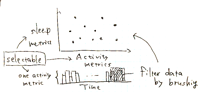
When we think of a specific relationship between two different aspects, looking into their correlations on a scatter plot is one of the most intuitive ways I can imagine. Plus, to show how the relationship has changed over time, I decided to put an interactive bar chart that represents the date on the x-axis. I believe time change is particularly important considering the pandemic and rapidly changing world.
Collecting and fetching data
There are many API endpoints Fitbit exposes, but I just need static, basic historical activity and sleep datasets for the time being.
I eventually noticed users can export the data from Fitbit Web Console in a batch manner, and hence I leveraged the tool for gathering yearly data in 2020 and simply uploaded them to this public gist.
Although Fitbit knows more about me, the ready-made datasets contain sufficient activity and sleep metrics associated with a timestamp to tackle the problem that I stated above; to be honest, I haven't cared much about the other types of information when I use the Fitbit app.
- Activity
- Date
- Calories Burned
- Steps
- Distance
- Floors
- Minutes Sedentary
- Minutes Lightly Active
- Minutes Fairly Active
- Minutes Very Active
- Activity Calories
- Sleep
- Start Time
- End Time
- Minutes Asleep
- Minutes Awake
- Number of Awakenings
- Time in Bed
- Minutes REM Sleep
- Minutes Light Sleep
- Minutes Deep Sleep
Once data gets ready, we can fetch the information from the code. In practice, it should be efficient and low-overhead for the code to manually preprocess these exported CSV files in advance, as long as the data is static and the problem statement is clear. However, I just separately handled the raw files as-is for the sake of practicing.
In React & D3, fetching multiple CSV files can be implemented as follows:
import { useState, useEffect } from 'react';
import { csv } from 'd3';

const parseActivitiesRow = (row) => {
  // cleanse a single acitivy record
  return row;
};

const parseSleepRow = (row) => {
  // cleanse a single sleep record
  return row;
};

const [data, setData] = useState();

useEffect(() => {
  Promise.all([
    csv(activitiesUrl, parseActivitiesRow),
    csv(sleepUrl, parseSleepRow)
  ]).then(([activities, sleep]) => {
    const data = ... // mmore preprocess, and join `activities` with `sleep`

    setData(data);
  });
}, []);
The use of Promise, useState, and useEffect is a key part of this code. You can learn more about motivation from the following videos:
- Datavis 2020 Episode 13 - Loading Data with Fetch, Promises, Aync & Await
- Datavis 2020 Episode 16 - Loading Data in React
Setting up efficient dev environment
As Datavis 2020 used VizHub, instantly seeing the results when you modify your code is powerful for developing an interactive data visualization app; unlike the other programming, data visualization requires us to tweak the details a lot in a rapid iterative fashion. However, at the same time, VizHub gives over-abstraction to me.
Instead, I have locally set up a similar development environment that improves my developer productivity, using BrowserSync. Here is package.json I'm currently using:
{
  "scripts": {
    "build": "rollup -c",
    "build:watch": "rollup -w -c",
    "browser": "browser-sync --watch scrits/bundle.js",
    "watch": "npm-run-all --parallel browser build:watch"
  },
  "devDependencies": {
    "@rollup/plugin-buble": "latest",
    "browser-sync": "^2.26.14",
    "npm-run-all": "^4.1.5",
    "rollup": "latest"
  }
}
Similar to VizHub, ES6 transpile is based on rollup.js and buble, and I additionally introduced watch in npm run scripts for hot loading.
Eventually, npm run watch opens a browser tab at localhost:3000, and you would see a change as soon as your code is saved:
Gaining insights from the visualization
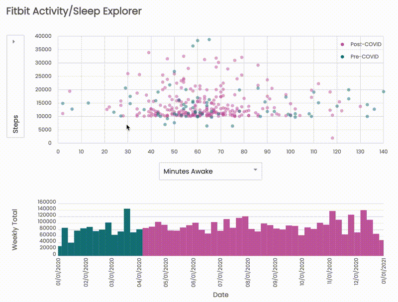
Finally, we have Fitbit Activity/Sleep Explorer as I demonstrated above. Let me recall our problem statements:
- What kind of relationships are activity and sleep have?
- Does being active lead to better sleep?
- How my activity and sleep trends have changed after the pandemic?
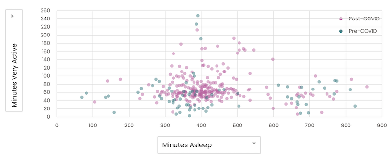
Of course, I should calculate correlations along with the charts, but, at a glance, there are no strong correlations between any of sleep and activity metrics:
The result indicates that my sleep quality isn't affected by an amount of activity that much, and there might be a different factor the current data doesn't cover (e.g., drinking alcohol, busy day at work). It's also important to double-check the accuracy of datasets; there might be a bug in the code and/or wrong interpretation of data.
On the other hand, it was interesting for me to see the difference between pre-/post-COVID distributions. Before the pandemic, from Jan 2020 to Mar 2020, both activity and sleep measures were wide-ranging:
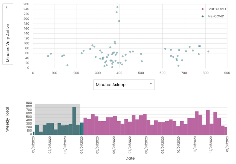
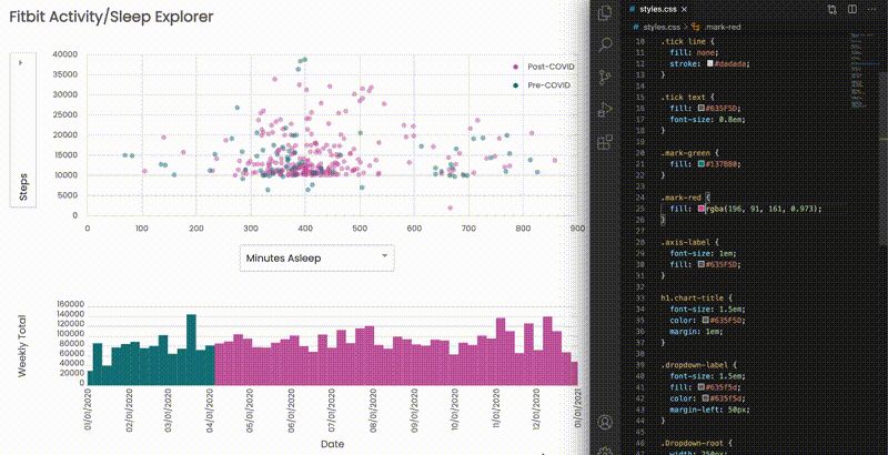
Meanwhile, from Apr to June when I was in the most strict stay-at-home order, the dots are more concentrated on a similar place of the chart, and the bar chart below also looks relatively flat compared to the past:
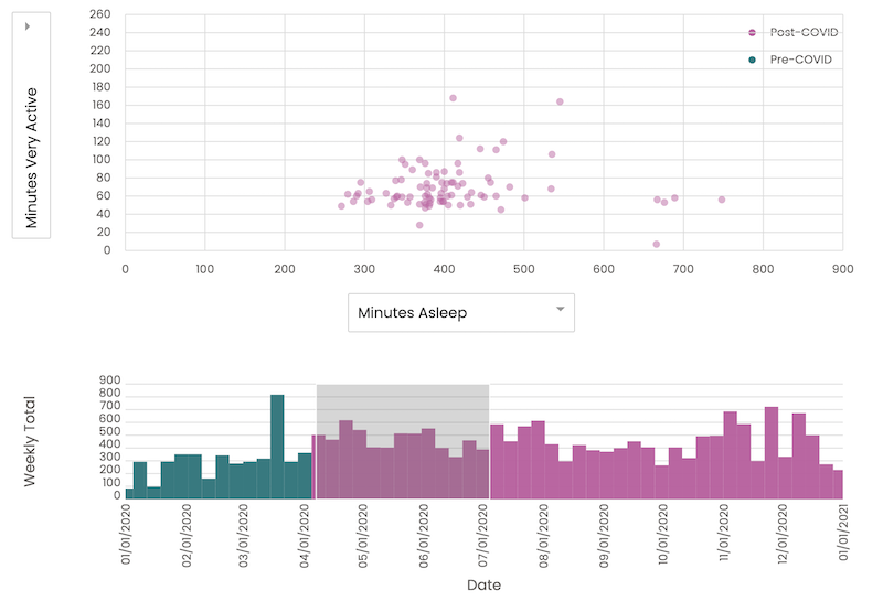
Hence, the pandemic surely made a big change to my physical behaviors, and it poses the need for more consciously working out and sleeping to stay healthy.
Even though what I've done so far is quite simple, we can infer so many things from the visualization without doing math. I believe it's a good first step toward Augumented Analytics, and interactivity is a crucial piece for making visualization more actionable.
Support
Gift a cup of coffeeCategories
See also
- May 5, 2022
- Starting with Empathy to #GetReal, Beat Loneliness, and Be Ethical. #MentalHealthWeek
- September 4, 2021
- Save HTML <svg> as an Image
- January 23, 2021
- Datavis 2020: A Free Online Course About D3.js & React
Author: Takuya Kitazawa
I am a product builder, mentor, and advocate for sustainable technology development with a decade of experience in AI/ML products, data systems, and digital transformation. Based in Canada and originally from Japan, I have lived and worked globally, including part-time residence in Malawi, Africa. Visit my portfolio to learn more about my work, or reach out to me at [email protected].
NowDisclaimer
- Opinions are my own and do not represent the views of organizations I am/was belonging to.
- I use Grammarly for correcting grammatical errors, but I do not rely on any other generative AI tools to create my blog content.
- I am doing my best to ensure the accuracy and fair use of the information. However, there might be some errors, outdated information, or biased subjective statements due to the nature of a personal website. Visitors understand the limitations and rely on any information at their own risk.
- If there are any issues with the content, please contact me so I can take the necessary action.