Before reading further, play with an interactive data visualization app that I implemented with D3.js & React: Flight Emissions Calculator
It's been a while since the COVID-19 pandemic arose, and one of the biggest changes in my life was a significant reduction of air travel opportunities both for business and private. This fact is very unfortunate for me because traveling was my greatest joy in life.
https://twitter.com/takuti/status/1207165848135168002
However, at the same time, there is a positive side in terms of the environment; it's obvious that air travel is environmentally unfriendly due to its significant amount of CO2 emissions, and hence fewer flights certainly reduce our overall carbon footprint.
Visualizing flight emissions
To realize the fact, let's see how much CO2 emissions my flights in 2019 have made:
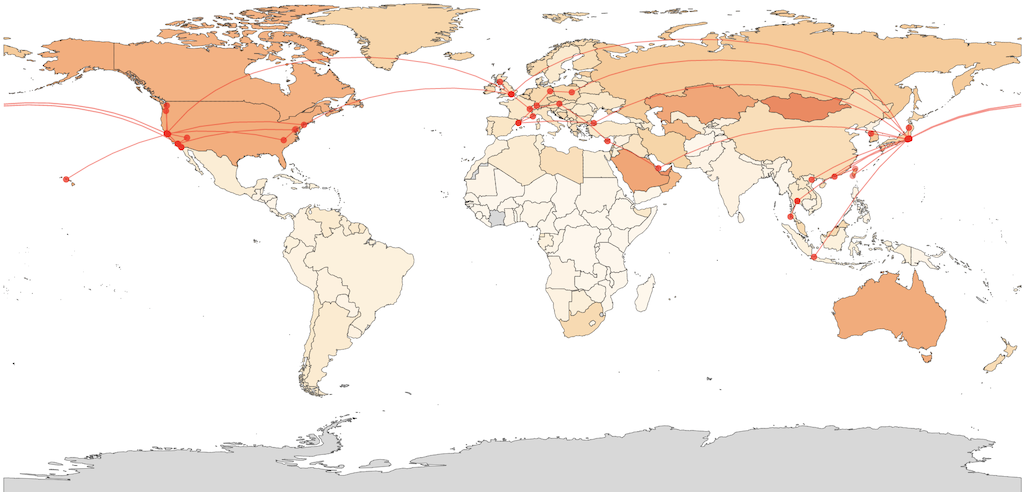
In this figure, colored countries represent that the CO2 footprint of my flights in 2019, which was about 24.239 tonnes, exceeded their per-capita yearly emissions. That is, I flew too much during the year and made more CO2 emissions than the personal averages of almost all countries in the world. For instance, a single person in Japan produced 8.7 tonnes of CO2 in 2019 on average, and my flight emission was greater than the number. It's shameful, and I shouldn't be proud of myself for being a frequent flyer.
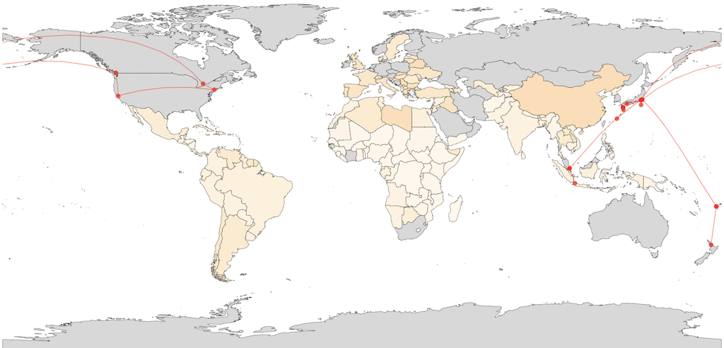
On the other hand, the visualization below depicts I flew significantly less than the last year in 2020 by making approximately 7.3 tonnes of emissions, which is one-third of 2019's record:
Key facts and datasets
To begin with, we need to know how much CO2 emissions each flight makes. Although there are many in-depth studies such as myclimate flight emissions calculation principles, I simply picked up some numbers reported in a BBC article; according to the article, CO2 emissions per passenger per km traveled are 133g for a domestic flight and 102g for a long-haul flight.
Next, Per-Capita CO2 Dataset in the "Our World in Data" portal tells us how much CO2 a person in each country produces. It's interesting to see the difference between developed and developing countries, and we can intuitively recognize that large countries such as the US and Australia are more environmentally unfriendly than the others. Meanwhile, for me, there are also some non-trivial observations in the dataset; I must educate myself more on the reason why Mongolia produces such an exceptional amount of CO2, for instance.
Finally, geographical locations of airports and distances between them can be obtained from Open Flights' Airport Database. Note that calculating a distance between two geographical points (i.e., pairs of latitude and longitude) is not straightforward, but geoDistance in the d3-geo package does the job. See a Wikipedia article about great-circle distance for more information.
These are the key ingredients to draw the pictures that I showed above.
Implementation
To implement the visualization, I was able to reuse many code fragments I previously created for Datavis 2020: A Free Online Course About D3.js & React; the course already taught me how to visualize a world map, how to add different colors to the countiries, and how to dynamically modify the view with useState, useRef, and useCallback.
One of the most important parts is calculating CO2 emissions of the flights entered into the text area. Assume a hash airports enables us to retrieve [longitude, latitude] by IATA 3-letter code of an airport (e.g., HND for Haneda Airport). Once the calculate button is pressed, the following callback function updates the parameters associated with the contents of the application:
const [coordinates, setCoordinates] = useState([]);
const [emissions, setEmissions] = useState(0);

const handleSubmit = useCallback(_ => {
  const coords = [];

  const totalKm = inputRef.current.value.split('\n').map((route) => {
    const [src, dst] = route.split('-');
    coords.push([airports[src], airports[dst]]);
    return geoDistance(airports[src], airports[dst]) * earthRadius;
  }).reduce((total, curr) => total + curr);

  const emissions = totalKm * emissionsPerKm / 1000000;
  setEmissions(emissions);

  setCoordinates(coords);
});
After setting the states, d3-geo helps us a lot to render the information; an array of pairs of coordinates can be easily represented on the map as multiple arcs, and I was able to easily imitate Great Circle Mapper, a well-known flight visualization tool on the web:
const projection = geoEquirectangular();
const path = geoPath(projection);

<path
  className="route"
  d={path({ type: "MultiLineString", coordinates: coordinates })}
/>
Eventually, my Flight Emissions Calculator app integrates flight logs with CO2 emission data on a world map.
Bottom line
Climate crisis is not somebody else's problem. It is my problem. But understanding the severity is indeed difficult due to the scale of the problem, complexity of the facts, and unfamiliarity of the numbers.
Here, visualization is a powerful tool that conveys the essential information in an interpretable way. Once we obtained the insights, we become able to more confidently and proactively take an action to keep or change the situation. That's why a good dashboard matters.
Last but not least, carefully reviewing visualization and its original data & eagerly seeking additional sources are the crucial next steps. Data becomes outdated, and we make mistakes when learning important facts and converting them into a functional application. Therefore, ensuring the accuracy of visualization is a fundamental step of a project so that no misleading insights are displayed.
Support
Gift a cup of coffeeCategories
See also
Author: Takuya Kitazawa
I am a product builder, mentor, and advocate for sustainable technology development with a decade of experience in AI/ML products, data systems, and digital transformation. Based in Canada and originally from Japan, I have lived and worked globally, including part-time residence in Malawi, Africa. Visit my portfolio to learn more about my work, or reach out to me at [email protected].
NowDisclaimer
- Opinions are my own and do not represent the views of organizations I am/was belonging to.
- I use Grammarly for correcting grammatical errors, but I do not rely on any other generative AI tools to create my blog content.
- I am doing my best to ensure the accuracy and fair use of the information. However, there might be some errors, outdated information, or biased subjective statements due to the nature of a personal website. Visitors understand the limitations and rely on any information at their own risk.
- If there are any issues with the content, please contact me so I can take the necessary action.